Hey there, WayMaker family!
Christina here, and I'm bursting with excitement to share some fantastic news with you all!
You know how we're always striving to bring you the best of the best? Well, we've been listening to your feedback about color vibrancy, and I'm thrilled to say we've made some serious improvements!

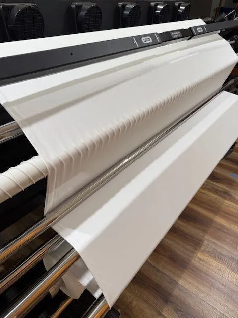
Let me take you behind the scenes for a sec. Several months ago, we updated our software in the hopes of improving our fabric vibrancy. One of the things that updating our software did was open up some new printing options. While relearning the new software, I stumbled upon something cool! It turns out, there was this new "HS" setting on our printer that we thought meant "High Speed." Plot twist – it actually stands for "High Saturation"! 🤯
I know, right? It's like finding a secret level in a video game!
We implemented the High Saturation immediately as well as made several other process changes to improve vibrancy and saturation on our natural fiber bases.
So, what does this mean for you?
In a nutshell: richer, more vibrant colors on all our natural fiber fabrics! 🌈
Now, I want to keep it real with you. Our natural fibers will still have a slightly more muted look compared to our polyester fabrics – that's just the nature of the materials (pun totally intended). But trust me, the difference in saturation is night and day!
We've updated our software, fine-tuned our systems, and we're now printing with this high saturation setting. The result? Fabrics that pop with color while still maintaining that eco-friendly, American-made quality you've come to expect from us.

I'm so proud of this improvement, and I can't wait for you to see it for yourself. Whether you're a long-time WayMaker or you've been thinking about giving us a try, now's the perfect time to experience our upgraded vibrancy! The photo on the left is of our Cotton French Terry showing the updated vibrancy.
We've put together an awesome vibrancy chart for you to check out. It's like a color roadmap for our fabrics! Each of our fabric bases absorbs ink in its own unique way, which means you'll see some variation in color vibrancy from one base to another.
Plus, lighting can play tricks on how a design looks. Our handy chart breaks it all down, showing you what kind of saturation to expect on each of our fabrics. It's super helpful when you're planning your next project! You can also order a swatch book and check out our fabrics' vibrancy. (P.S, You'll get FREE Shipping on the Swatch Book and $5 credit towards your next order!)

Thanks for being part of our journey towards better, brighter fabrics. Your feedback drives us to keep improving, and we're just getting started!
Happy crafting!
Christina


0 comments