There are millions of ways to dye fabrics! Vat Dying, Digital Inkjet Dying, Disperse Dying, Sublimation, Digital Printing, Reactive Dye... the list goes on and on. Here at WayMaker, we use a combination of Sublimation and Digital Printing to transfer our designs to our fabric bases. But how does the different dying processes effect vibrancy on our wide array of fabric bases?
Let's dye-ve into the process!
First Things First: Dye Sublimation vs Digital Printing
Dye sublimation
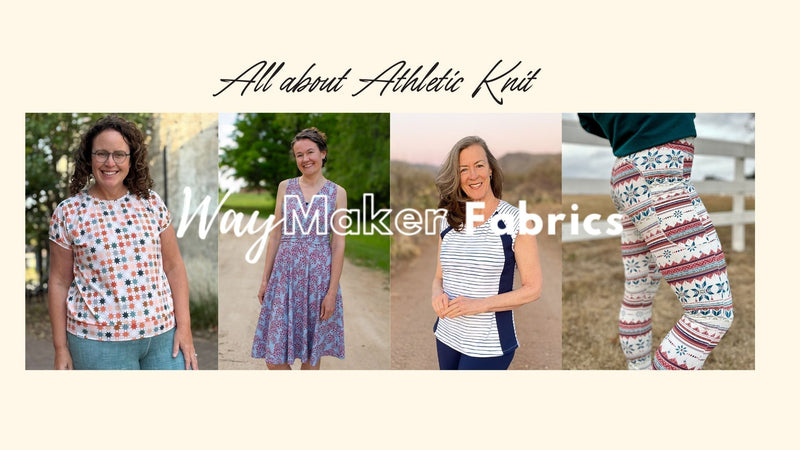
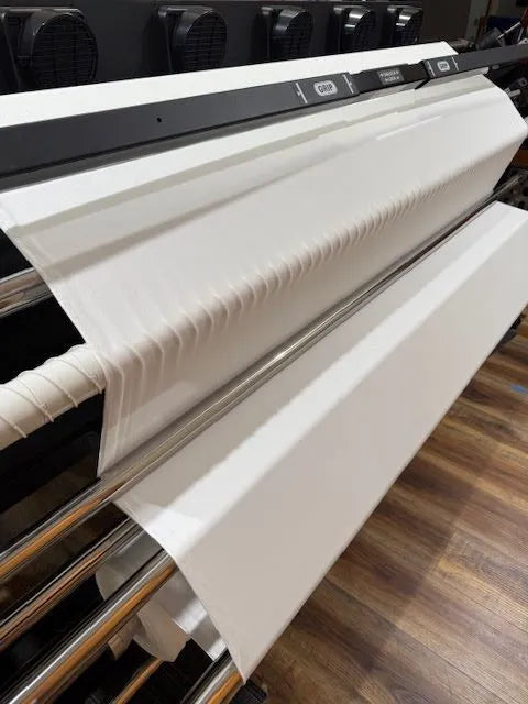
Dye sublimation is strictly for synthetic fibers, like polyester. WayMaker Fabrics prints the design onto a clay paper, and then transfers the design to the fabric using a heat press. (It's like a giant T-Shirt Iron On!) Currently, we offer 3 polyester bases: Athletic Knit, Jersey, and Stretch Twill.
The Athletic Knit and the Jersey need to be exclusively dye sublimated, but because of the cotton content in the Stretch Twill, it can be printed on Digitally, or dye sublimated.

Digital Printing
We use Digital Printing to print on natural fibers. Think Cotton, Modal, Rayon. With Digital Printing, the design is printed directly onto the fabric! This process works like a home printer, just a much larger scale. Tiny ink droplets are sprayed on the fabric to produce the desired color and image. Once the design has printed, we use the same heat press to seal the ink into the fabric. Until it is heat set, the ink can be washed out in a normal wash cycle. Pictured is our Cracked Ice design and is printed on Modal French Terry.
Color Vibrancy Depends on Fabric Bases!
As of February 2024, WayMaker Fabrics offers 11 unique base fabrics! We're always interested in adding fabrics, so check our website waymakerfabrics.com to see if we have added any since you found this blog.
Each of our base fabrics reflect color vibrancy differently. This is due to fiber density, fiber content, and the weave or knit of the fabric.
Synthetic fibers like polyester tend to produce more vibrant colors than natural fibers. There are a few reasons for this. Synthetics are engineered to absorb and retain dye molecules. The polymers in these man-made fibers are heat-resistant, allowing them to withstand the high temperatures needed for dye sublimation. Natural fibers like Cotton, Modal/Tencel and Wool lack these properties. Synthetic fabrics printed with the sublimation technique result in bolder, more vivid hues compared to printing on natural textiles.
The vibrancy of natural fibers can vary for several reasons. The specific type of fiber impacts vibrancy - Cotton reflects color differently than Modal/Tencel, Wool or Silk. How the fibers are constructed also matters. A tightly knit fabric will show color differently than a loose weave. If the fabric has been brushed or treated to create a soft, fuzzy surface, this will scatter more light and dilute the color. The density of the weave or knit pattern also affects how vividly the fabric reflects printed designs. All of these factors change how ink is absorbed and reflected back from natural fabric surfaces. So, when printing on natural materials, the exact fiber content, weave style, surface finish and density all contribute to the final vibrancy of the printed colors.

The color of the fabric prior to dying or printing also reflects the outcome of the color you see. If a fabric is bleached bright white it is going to have colors that match the digital image or the color code input for printing, but if the fabric is not bleached bright white, but is an off white or light cream color, the blues will appear greener as it mixes with the color of the fibers.
Pictured are three different fabrics that are processed/created differently. Athletic Knit is a Polyester fiber and is engineered to absorb and reflect the color. Cotton French Terry is 100% cotton and is more muted than the Athletic Knit. The fabric is bleached bright white and treated specifically for digital printing. The final fabric is a Modal French Terry. Modal is a natural fiber, but this fabric is more of a cream or off-white color prior to printing; therefore, the blue ink mixes with the cream (yellow) of the fibers to produce a greenish color on the finished fabric.
None of these are right or wrong, they are just different. Differences are normal in digital fabric printing. I believe in honesty and transparency, and part of that is being clear and honest about our processes and fabrics. I continually strive to improve processes as well as distribute information to you. I want you to love everything you purchase from WayMaker Fabrics, and I want you to know what you are going to get before you get it.
We've created this handy chart to compare different vibrancies before you buy our fabric online, print width, primary fiber content etc.

We offer the following stretch fabrics:
Cotton Lycra
Modal Jersey
Modal French Terry
Athletic Knit
Jersey
Stretch Twill
We offer the following non-stretch fabrics:
Tencel Cotton
Quilting Cotton
Rayon Crepe
Cotton French Terry (it has some ease/give but no true stretch)
Canvas
But the fabric I order from XYZ company doesn't have varying color vibrancy. Why does yours?
I cannot fully answer that for you. I can share with you that in America, we are regulated regarding environmental impact, so using an environmentally friendly printing process is important. You might be ordering fabric that is printed or dyed overseas where attention to environmental impact or health impact is not as important or regulated.
You might be ordering fabric from an American retailer that prints/dyes in house. They might have a different printing/dying process and have invested millions into their machines. We one day hope to achieve this level of production, but for now, we are still a small shop.
According to Fortune Business Insights, Asia Pacific dominates the Textile Export industry. This is not only the fabric they manufacture but includes printing (while less common) and dyeing (more common).
American digitally printed fabric is on the rise, but we still import a great deal of fabric from overseas. Digitally printing fabric is a fairly new process, but it has really opened up the market, and as the market shifts new technology will arise, and digitally printed fabrics will continue to improve as technology improves.
If color vibrancy is the most important thing to you, I recommend purchasing the Jersey or Athletic Knit, as they have the greatest vibrancy. If you love the design, our mission, or supporting small companies, and you don't mind a more muted print, then shop any of our 11 base fabrics with the understanding that we have varying vibrancies across the 11 bases.
Do you offer physical fabric swatches so I can view the true colors and vibrancy before purchasing? I'd like to verify the shades in person!
We are so glad you asked! Our fabric swatch books let you preview the full spectrum of shades and hues across all our 11 base fabrics.
It's a rainbow of fabrics at your fingertips! Compare pops of color on synthetic fibers next to rich tones on natural fabrics. See how colors dazzle on Athletic Knit or become muted on Cotton Lycra. You'll be amazed at the difference real fabric samples can make.
Best of all, the swatch book pays for itself! Order today and get $5 off your next fabric purchase. The swatch book is totally FREE with your fabric order!
Click here to pick up a swatch book today!
Still have questions about fabric vibrancy?
We'd love to hear from you and address your concerns! You can reach out to us using the contact submission form.


I learned a lot! Even the idea that the brushed surface scatters the light and makes the colors more muted…well, it was a bit like science class! Thanks, Christina!